Icon Living
This began as a very straightforward ask to mock up a landing page for the clients upcoming distribution engine campaign and ended up being a small study in iconography and a clear example of what can come out with a little bit of freedom and cooperation with your designers.
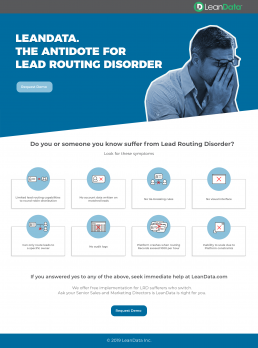
As you can see it shows a relatively digestible amount of content with a fun parody of associating illnesses to common corporate issues and somewhat a rip on a generic pharma template.
But where we had fun was with the creation of our visual descriptors given that we were only given written examples of what our symptoms could be. That paired with a similar style that we developed for their case study videos that I had been working on at the same time lead to these fun little guys.